Games Art and Design

Games Art and Design

Monday 14 December 2015


      Since the end of the last project there's been a little bit of a gap in my work, but I've been keeping myself busy with other works, simply practising my digital painting with the end goal of making myself a better artist.

      These pieces are works in progress and the aim with them is to simply try out new things, make mistakes and most importantly, to learn from those mistakes so that I can become a better artist. 


      I've also been practising drawing using traditional media, looking mainly at anatomy, since that is what I struggle with when painting, though I will start doing some still lives, and value renders of different objects in order to practice painting different materials and various objects.
Self-Evaluation


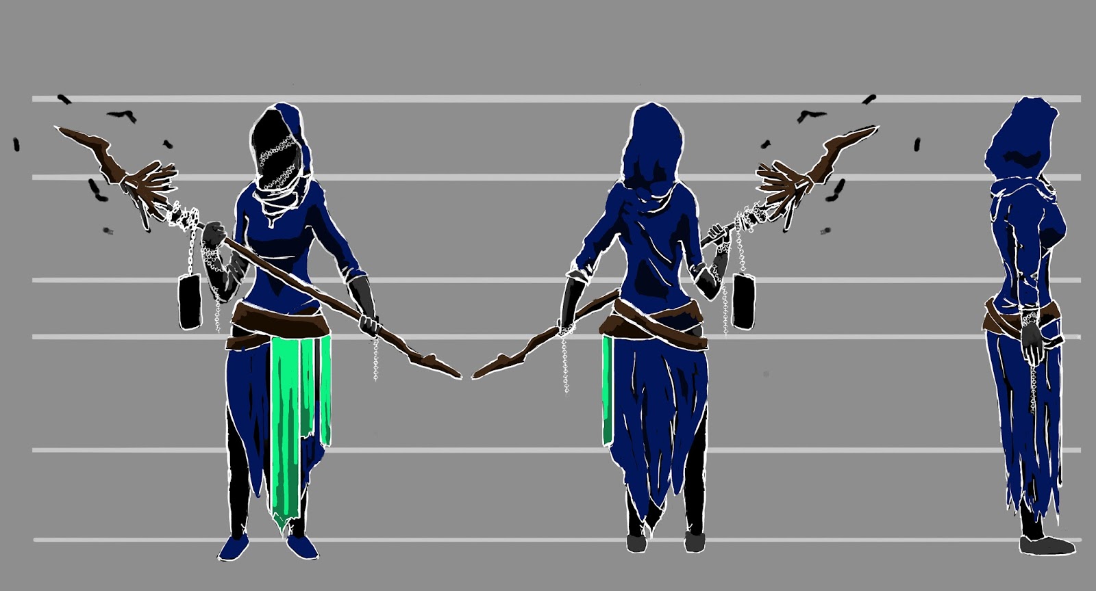
      Throughout the course of this unit I feel like I have progressed as an Artist, learning more about various digital painting techniques and more about the design process in general. I think that all three projects have been a success, although looking back over them, if they were going to be extended I would do more work on the character sheets, as I think that I still need to figure out how to approach them as dynamic, minimalist pieces of work.

      The first task, designing an insect was something new to me, as I hadn't done much creature work before, digitally or traditionally, and while it was new territory for me, I still enjoyed it and I feel like if I were to be asked to design another creature of some description, I have a good grasp of what it is exactly that I need to do to complete the task.

      The second project was much the same as the first, I’d done still life drawing before in my traditional work, and only a very small amount as practice in my digital work, but I feel like going through the entire design process like that has helped me to understand how items and weapons get designed, and it’s boosted my confidence for the future, although next time, I think I’d try something a bit more obscure than a staff, like a pendant, so that I could get better at painting the small details and other materials, like metal.

      Finally, the third task has really got me to experiment with different methods and styles, ranging from a photo-realistic view of the character to a very stylised and cartoonish look that can be seen in the clothes designs. In the future, if I was working for a client, I would most likely stick to one style of working, but I think that in this learning stage it is good practice for me to be trying out as many different styles and techniques as I can, much like the one that I used in the final piece, which I am very pleased with as a more expressive and loose piece.

      I think that I need to focus on my anatomy, and my digital drawing, as it still feels slightly wrong or overly hard to draw and paint the figure without making several errors that then need to be corrected afterwards. It would speed up my workflow greatly if I managed to get figure drawing down properly. Life drawing is helping, and I’m getting back into sketching which will help to improve this, but I need to practice. Another thing that I feel I could improve upon is the contrast and detail in my paintings. I can see it with some of the materials, and it reminds me that I need to improve upon the work that I've already done. I also feel as though I need to get better at detailing my work. Perhaps not in the early stages of the design process, but definitely in the later stages such as the model sheet and the final render of my designs. In order to stop my work from becoming too illustrative I think that I need to focus on a single area that needs focus, and then draw attention to it by rendering everything else with less detail.

Thursday 12 November 2015

      I had a little trouble starting out with this final piece, as although I was able to create several interesting compositions, I wasn't able to realise them in a way that satisfied me, and I kept on restarting the process, until I decided to try something a little more experimental, and something that I'm not really used to, which was to loosen up my work, quite drastically to create an interesting and appealing narrative piece.

Wednesday 11 November 2015

      Having finished all of the aspects of my character, I created a model sheet so that I could get the anatomy correct, as well as beginning to get a feel for how the character should look and what style of painting I'm going to use.


      After the model sheet, I made this character sheet to show how my character would move and stand in the world. I went against the archetypal witch in the design of my character, and I created this in the same vein, trying to show fluid, graceful movements, possibly even seductive motions in the way that she walks. I found that while I was able to get that appeal in the first of the 'walking' poses, the others didn't quite have the same effect.


      Before heading into a final render of the character, I wanted to see how I could present it in a variety of ways, although I went with quite a dark theme, using things like smoke and forestry to create atmosphere, as well as having a single, small main light source. I also did some compositions with a more portrait, up close view to compare the two different types of composition.


      Now that I'm mostly done with this project, I can feel it coming to a close, and I feel like I've learnt quite a lot of new stuff during this project, as I've used new techniques that I otherwise wouldn't have used, either because I didn't know what to do, or because I feel like my work wouldn't have been as strong as if I'd used a technique that I'm comfortable with.

      An artist who I've been enjoying for the past couple of weeks now has really helped me get to grips with painting in a really expressive way, by looking at his works and figuring out how I might be able to create the same effects in my own work.


Friday 30 October 2015

      Having created a variety of designs for the clothes, I moved on to the staff to create something that reflects the twisted characteristics of the witch. While these designs are simple silhouettes, I don't need that much information from them to see what I want to create.


      After completing the character prop, I began on the face of the character. What I wanted to try and achieve was something distorted and unbelievable, akin to the nurses in silent hill, whose faces have been twisted into something else. There are aspects from a couple of these designs that I quite like, and I'll incorporate them into the final design of the character.


Tuesday 27 October 2015

      Having chosen my silhouette, I went into a series of iterations, looking at various aspects of the character, stating with the clothes - I had the silhouette, but the style of clothing helps me to get to know the character more, revealing personality traits that you can't glean from the shapes in the silhouette.

      I also played around with the colour of some of the designs that I liked, as colour also gives an idea as to what kind of traits the character has. For example; warm colours such as red signify aggression, while cooler colours such as deep blues signify things like submission, which is why those opposites are used in video games to highlight both enemies and friendlies.


      Onto week 5 now, and the third task has been given. I wasn't quite sure what to do with the era that I was given at first (Georgian Europe), but after reading the short story, 'The Tinderbox', I decided that the character that would give me the most artistic freedom was the witch. I chose the witch because people were still very religious and superstitious during the Georgian Era, and so anything described as a witch would most likely be something hideous and fantastical because of folk tales, rumour and superstition.

      Found a couple of artists who I'd quite like to emulate in this project as they have a nice painterly style to them, while maintaining a degree of realism in their macabre images.


      The brief gave me a selection of character profiles to choose from, and I had to design them with the Georgian era in mind. The types of characters we could design were based in a short story titled 'the Tinderbox', and I chose the witch of the story as I felt that it would allow me to have a lot more creative freedom when designing the character.

      My initial silhouettes are very ranged, from haggard and crooked characters to more war-like, battlemage type characters. In the end, I chose a mid ground between the two as that lets me design someone more youthful and magical, without the character being necessarily deformed or inherently 'evil'.


      Having done my silhouettes, I did a fair bit of research, looking at Georgian era clothes, props and people, to get an idea of how my own work should look and feel like. Initially, I looked to artworks of people and images of military and industrial equipment so that I could figure out how my character would interact with those different types of item and the characters that would utilise them.

Saturday 24 October 2015

      For the final render of my object I wanted to give it an air of mystery, and I decided on the cave/temple/pedestal idea, with a light from the top shining down onto it and illuminating the cave. The light took on a very blue hue, so as to simulate the moonlight, and that meant that the piece was dominated by cool colours, with warmer colours lining the edge and highlighting the timepiece.


      I think that this week (and the project in general) have gone really well. The model sheet was a little bit of a pain, but once that was finished I began to play around with how I could present my timepiece, and the quick, really loose compositional drawings were quite fun to do, imagining how the object would interact with the world and how it could be used. 

      In the end I decided that I would present it as something forgotten, hidden in a cave and waiting to be found by an adventurous person as I think that presenting it in this way gave me the best opportunity to show its mysticism, and create an ethereal atmosphere around it.

      Found more artists that I like this week, they caught my eye because of the mood that they create in their pieces, something which I undoubtedly need to learn how to do and improve so that I can influence my viewers in the way that I want to.


Wednesday 21 October 2015

      For this project, before I start to paint the final render, I wanted to play around with how I should present the timepiece. Because it's a swordstaff, it could be wielded by a mage-like character or a more aggressive warrior type. Alternatively, I could present it as something forgotten, wrapped up in vines, or something revered, placed upon a pedestal in a temple.


      The model sheet for my timepiece was fairly easy and comparatively quick to make, because I only need three different angles to make the design workable, those being front, side and 3/4 views. If I was doing a model sheet for a building, or asymmetric object, then I would need to do an additional view, and if I were doing this for a character, then it would be useful to get top-down and bottom-up so that the character model can be created accurately.


Monday 19 October 2015

      The iteration stage for this design is where I really altered and fleshed out what I wanted the design to be. I'd chosen the staff as my concept, and I began to play around with the two main areas of the design, changing the head and any decorations, before focusing on what the main part of the staff would be like.

      I settled for a bident-like swordstaff, with the center of the bident acting like an hourglass, as sand continuously falls from a micro singularity, while the main part of the staff is further divided into three sections, a pyramid which spreads out into a hand guard for the user, and finally ending in the blade of the staff.


      The third week has brought the start of a new project, and although I didn't really think much of the title to the project, I found myself enjoying using alchemy to create random images that let me see shapes relating to the title of 'timepiece', and giving me inspiration to design something interesting.

      One of the first standalone ideas that I had for this project is something that I would quite like to complete as a small personal project in the future, where a nebula is getting sucked into a black hole, and a thin contrail is being ejected out the other side, like some sort of cosmic hourglass.
      The research for my timepiece varied greatly, at the time, I wasn't sure of what I really wanted to convey, did the object have gears, or a natural substance to indicate the passing of time? Was it a weapon, or a purely magical or mechanical item? I tried to address these things while I did my research to let the designs I'd made fully realise in my head.


      During the early stage of this second project, I wasn't entirely sure of what I wanted to create. I had a couple of ideas that seemed like they could work in theory, but when it came down to getting the paint on the canvas I realised that they weren't quite feasible to work as timepieces. Nevertheless, they appeared in the early stages of my designs, and new ideas came from them, so they were put to use and influenced my design choices.

      'Victory' by Kipine makes very good use of light in his images, which is no less prevalent in this painting. There is a fair amount of bounce light on the side of the creature's neck, illuminating the downy texture in a very soft light, when compared to the more intense light that falls on the other side of the creature. There is also a little subsurface scattering of light in the eye, causing it to appear almost luminous due to how the light has interacted with the different part of the animal.


      'Glacier' by Sahir Khan is very interesting because of the amount of reflection and refraction seen in the piece. The green colour of the ice adds interest to the piece as well, highlight the subsurface scattering in the areas of what would be thinner ice, due to the desaturation of colour and an increase in value. The piece is also interesting because there aren't really any shadows, as the entire piece is either lit by direct or bounce light.


      'Follow the Light' by Ćukasz Wiktorzak uses an "L" frame composition, seen by the foremost tree, which branches up and over the focal points in the piece. This piece could also be drafted into the divine proportions or golden spiral method of composing an image, as the eyes are drawn to the warm, orange light in the lower, mid-left section of the painting, and are led up and around the piece by the diagonals of the boatman's oar and the crocodile's mouth.


      'Panda' by Mazert Young uses a nice compostion, although it is quite hard to discern which category it falls into. I would say that this piece either uses an Iconic style of composition, or the technique called 'the cross'. I think it could be put into the cross because of the way that the piece is split, with dark being painted on light on the right and light being put on dark on the left of the piece. This could also be an iconic composition because of the dynamic upfront positioning of the character in the image. 

Saturday 10 October 2015

      The final render of the insect took quite a long time due to the number of different parts on the insect, but I feel like the slight off-centre composition and high contrast add mood to the painting, and the angle of the insect allows for narrative as the creature could be feeding or stalking its prey.


Tuesday 6 October 2015

      This page details the movements of the creature, looking at each of the different aspects of it so that 3D modellers and animators know how the joints in the creature work, which will speed up the workflow of the design team.

      Character sheets like this are really easy to create and they help a lot when it comes to rigging a skeleton for the character/creature in the later stages of production.


      The second week went pretty quickly, but I feel like it's gone well. The insect's character sheet could probably have been more dynamic, instead of just a fake anatomy lesson, but that's something that I can improve upon in future projects. I'm also really pleased with the final render of my insect. that is one of my first completed digital paintings, and I feel like although I have got a lot to learn in terms of software and its capabilities, I'm making progress in transferring my traditional fine art skills into digital media.

      Found a few artists that I like as well, some of the have a very realistic style, while others are much more expressive. I think that I prefer the expressive style of most artists because it feels like the paintings have more energy in them, which is something that I would like to achieve in my own works.


Monday 5 October 2015

      This stage took didn't take that long, but I feel like I have resolved the silhouette completely into an actual concept for an insect.

      In the end I took parts and inspiration from the other silhouette designs that I had made and combined the best parts of a select few to create the final concept, developing the various parts of the creature throughout the process.


Wednesday 30 September 2015

      In the research stage of the project I focused into a few different areas; form, legs and eyes being the main focus as I want to capture the essence of what an insect is, and still create something that is unique and has an otherworldly quality to it.

      I also looked at images of insects within their habitats for both compositional ideas and to see how closely insects interact with and become a part of their surroundings.


      During the silhouette design process I didn't really have any idea what kind of insect I wanted to design. As a result, while most of the designs have insect-like qualities to them, they are mostly from original thought, with inspiration taken from real life insects.

      During this stage I tried to think of what kind of environment the creature would live in, and design accordingly. As a result, a lot of the designs have sharp, rocky features to them that would act as camouflage in either urban or rural environments.

      I didn't choose to design an insect with wings as I prefer the stalker-ish appeal that land based insects have, while I think that wings can enhance the look of an insect, I find that with most of my own designs, wings would most likely diminish the overall look of the creatures.

      Something that I'm quite happy about my designs is that they could quite easily be transferred from organic to synthetic quite easily, with a few minor alterations to the interiors of the designs.